When I was a young designer I imagined myself an “impresario of inspiration,” or like a sorcerer pulling together all sorts of design inspirations, fabrics, eras, references, materials. I did not, however, imagine myself as a rigid Miss Trunchbull-type, slapping wrists and insisting that we stick to the plan. But somehow I am both. More of the former and less of the latter, I like to think.
The process of design at KovichCo is straightforward: a robust intake with our clients to establish needs and wants, we develop a design direction (concept), develop the design and make selections, generate the construction documents and specifications, select and propose all furnishings, art, and accessories (FF&E), review and assist during construction, and eventually install the FF&E and complete the project. It’s a long road we walk with our clients; mostly over the span of 1-3 years. We work closely with them to hit those big milestones (and many sub-milestones) and to maintain focus on the vision which is crucial to a successful project.
I believe the key to a successful interior is to create your story and stick to it.
All of us are bombarded daily with new images, new materials, new home features, new lighting, etc. Even if you aren’t working on a project, you can’t escape it. And if you are working on a project… good luck. Those cookies and algorithms follow you. Every chandelier you have ever looked at will resurface in ads as you go about your life. It is easy to be overwhelmed and swayed by those persistent robots.
This is where my Miss Trunchbull reference comes in. One of our many tasks here is to be the rigid filter for our clients.
This is not a “less is more” thing. I see it as a matter of “timing your more.” At the beginning of your project, welcome all your inspirations with open arms. Then, take those inspirations, understand them, then connect them into a “concept.” If you are not familiar with what a “design concept” is, it is an idea that underpins and guides the design. It can be a word, a phrase, an image, a set of images, or a narrative. We often combine several of these. But narrative, or story, is the most fun.
A good concept needs to be broad enough to cover the whole design (whether it is a room or an entire house) but rigid enough to hold its shape. Think of it as the gelatine to Jello: clear and flexible when done right… but if not set properly, a big mess. A solid concept creates a boundary edge for what your project is, and most importantly, what it is not. Constraints are our friends.
Finally, a good concept is clear. I have seen a lot of concepts out there that are too broad or vague. “Warm modern” is not a good concept (sorry folks). One can describe a room as “warm modern”, yes, but it is not strong enough to hold together the design of a project. This concept lets too much in. We think we know what “modern” means, but the true test is knowing what modern isn’t. I can’t think of many things that aren’t modern, can you? The likely outcome of selecting such a vague concept is an interior that is muddled or boringly-safe. You may end up with a space other people like, rather than something you love.
In contrast, on one of our projects, we created a design concept consisting of a page of found imagery and the words “molded earth.” Although it's a pithy two-word combo, the story goes much deeper. “Molded Earth” refers to our project’s focus on bringing in natural materials and those that can take on a form: stone, terracotta, and concrete. It also refers to a few principles of Frank Lloyd Wright that guide this project that speak to creative energy and malleability. This concept provides both inspiration and structure.
Or how about “Moody Night-Birds”? This was a concept we workshopped with clients when they found an image of a fresco with a background of a dusky teal garden full of lively birds. We could never have guessed it, but when our client came across the image in a book; it hit her right in the gut as “this is the feeling.”
Now, how does one create a good concept? We don’t really have a formula, but these four general principles apply more often than not:
- What should the finished product “feel” like? Dig deep here, do not settle for words that could describe anyone’s project. Instead, look for the elements and ideas that make your project uniquely yours. The underpinnings must be highly personal.
- Don’t get stuck on words; look to images. But also don’t get stuck on pictures of rooms. Explore other inspirations. Look for a painting, a photograph, fabric, or a sculpture that gives you a gut feeling.
- Get deeply curious about everything you are drawn to. Dig down to the “why” and this will set you on a more authentic path.
- Free yourself from the tyranny of “timelessness.” Timelessness is an illusion. Focus instead on love, the feelings and ideas you truly love.
Any design project is a big undertaking. Remember to cast a wide net, be very curious why you actually like something, and what you really love. Once you make those decisions, the story itself will flow. And once you have that story, be absolutely merciless, downright Draconian. Look in the mirror, and say it with me now: “I am the open-hearted Trunchbull.”
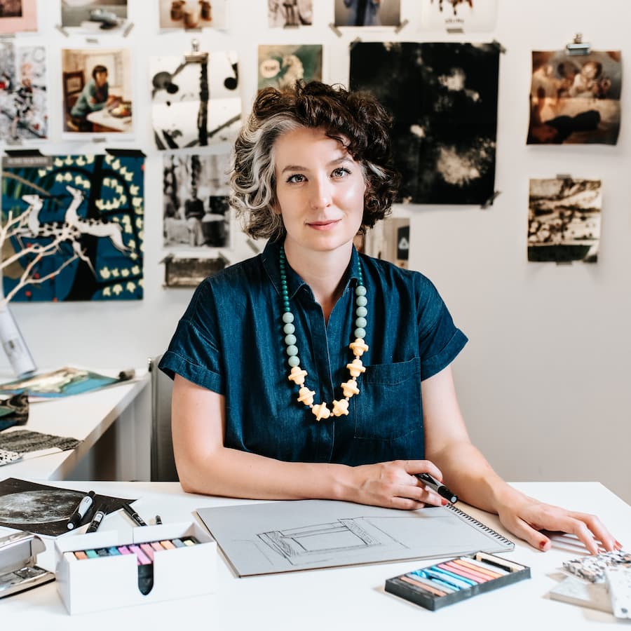
Photo Credit: Heather K. Purdy
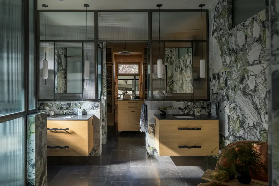
Photo by Gabe Border
This concept for this project was “Scarpa in Venice” was inspired by our clients love of Italy, and photos taken by photographer Heather K Purdy of Rome and Venice. Our story shifted to Venice where we looked at a lot of Carlo Scarpa's work and how the modern interacted with the classical/ancient/decaying. That tension, and Italian Modernism in general, guided all our decisions on this Primary Suite remodel.
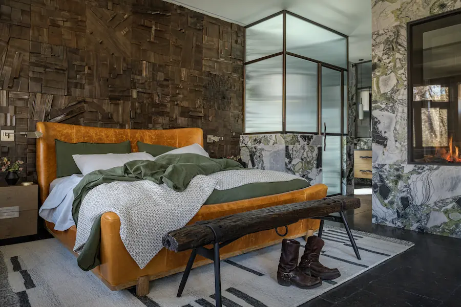
Photo by Gabe Border
View from the bedroom into the bathroom on our “Scarpa in Venice” project
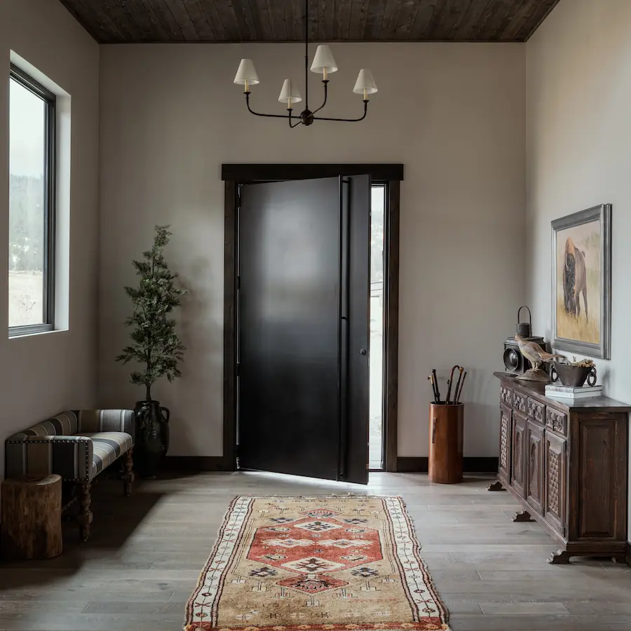
Photo by Gabe Border
The concept for this private ranch was “Welcoming Ralph.” The slightly cheeky narrative we imagined was a clean, modern ranch house with enough warmth and rustic touches, that even Ralph Lauren (known for his richly layered and eclectic Colorado ranch) would feel welcome in.
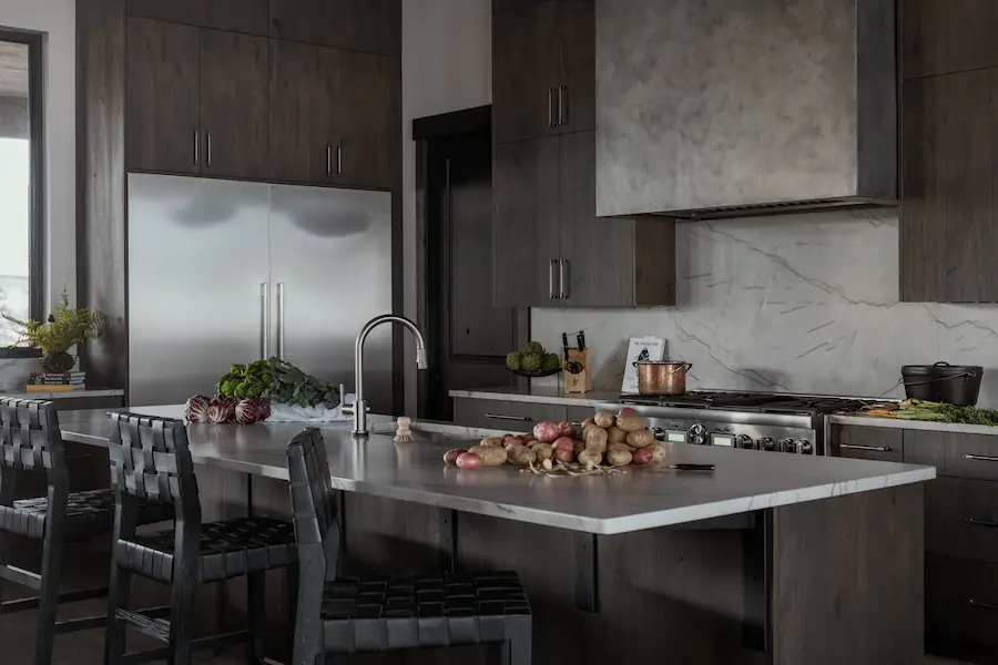
Photo by Gabe Border
The kitchen of the same “Welcoming Ralph” ranch
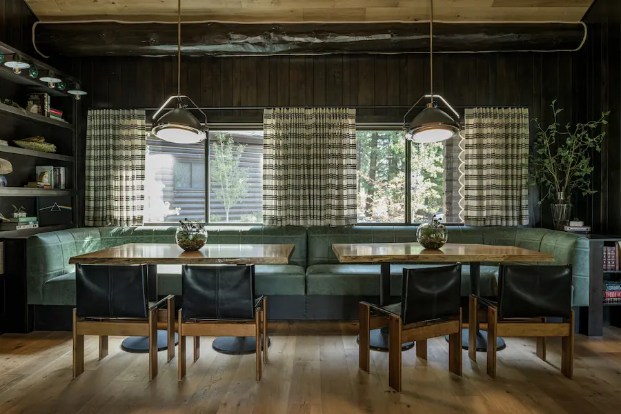
Photo by Gabe Border
This project was a major gut remodel of a pine-log cabin. Our concept was very layered, but in shorthand came to be “Owl’s Nest.” The story evolved to be the idea of a cozy bird's nest built into an old tree, with the “new” and “old” coming together seamlessly in something that felt like it was ‘always there’. Our clients were lovers of clean contemporary design, but we knew it would be a misstep to go “too contemporary” and have the updates and additions of the property feel out of place. We intentionally blended selections that were contemporary, industrial, and rustic to make sure that each area felt balanced.
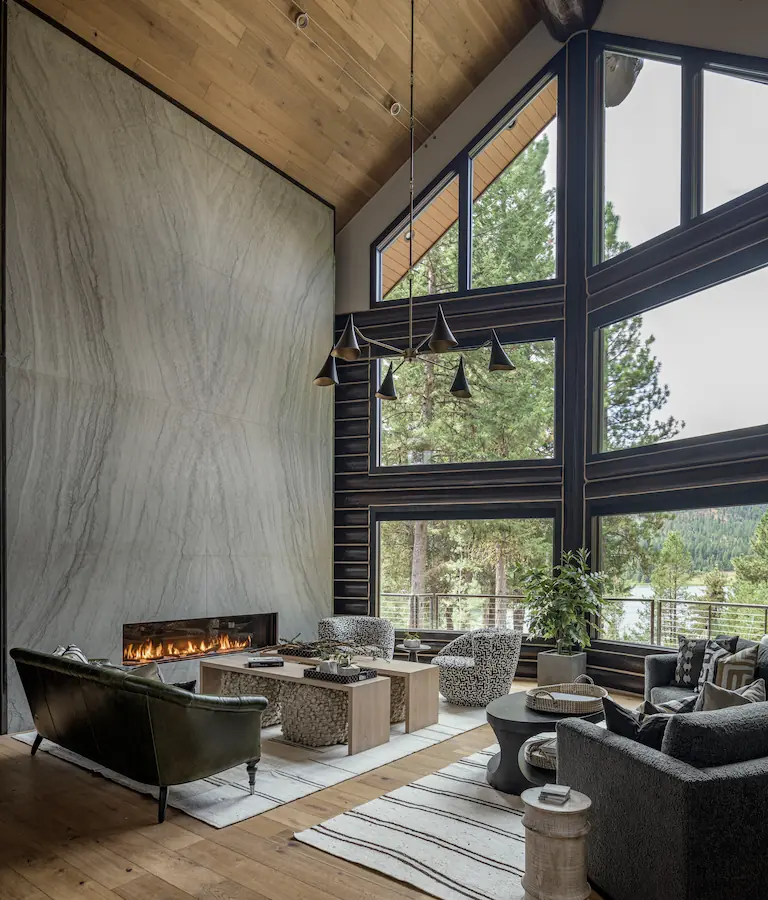
Photo by Gabe Border
Living Room of the “Owl’s Nest” project
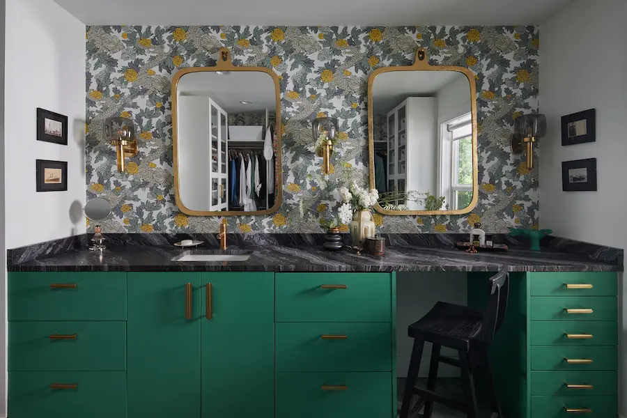
Photo by Nelson Olivo
The concept for this Dressing Room space was “Grandma’s Jewelry Box.” The idea behind this was a pairing of the “old-fashioned” and an edgier “deco” vibe, with great focus on the space not feeling too literally one or the other. Imagine finding a vintage jewelry box with decoupage flowers on it, but when you open it… it contains a few beautiful art deco pieces and a snapshot or two that make you think… Granny just might have been a flapper.
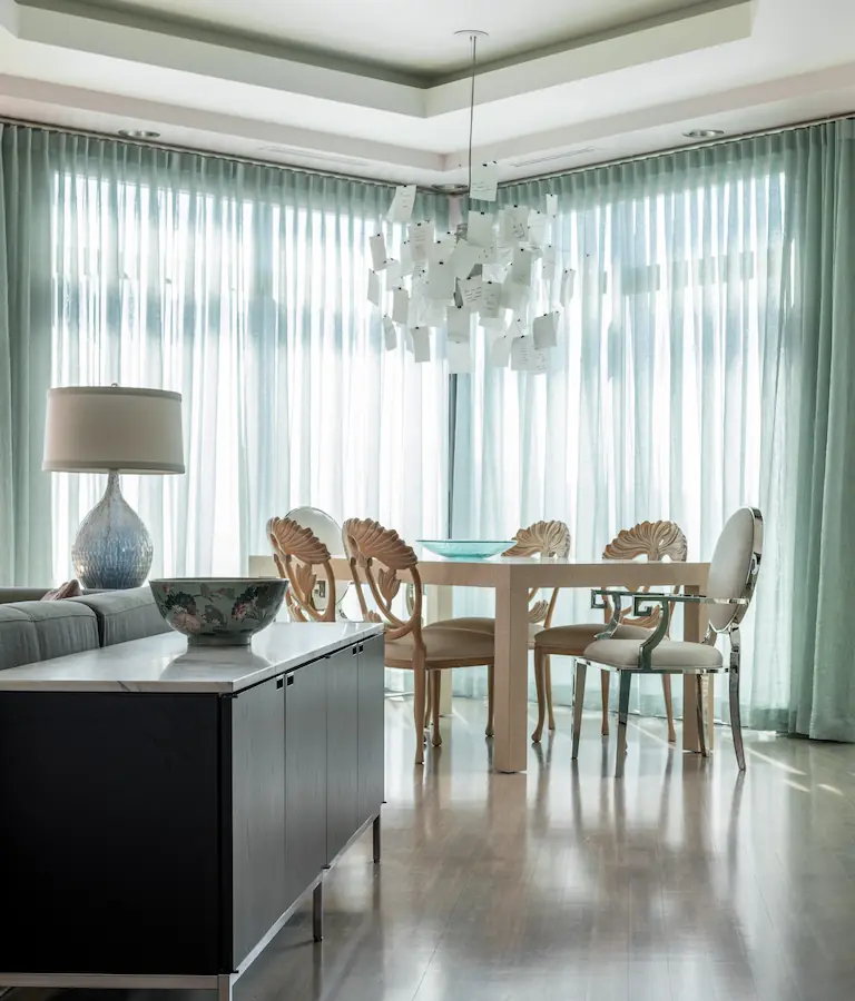
Photo by Gabe Border
This project was a condo for a client that loves her homes to feel un-ashamedly feminine. Our concept was “Cloud Condo”, a nod to the fact that the property felt nestled in the clouds with incredible views of the city and to the ethereal, floating mood we were hoping to create. A painting of wispy clouds with pale greens and pinks became our color palette. We contrasted these airy elements with a number of modern pieces our client had, and added a few of our own.